
Tuesday, January 25, 2011


Thursday, January 13, 2011
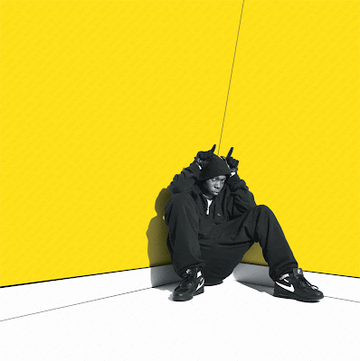
My artist
For my artist i have asked a friend to model. The artist i have created is called 'Jules' taken from the name of my model, i want my artist to resemble the original Grime artist's like Dizzee Rascal which is why for my front cover i want to use the idea from Dizzee Rascal's album 'Boy in da corner' a very simple shot of him sat in the corner of a room with his knees up. Personally i think the simple shot's can be the most affective, i'm going to use the studio to take the photo for my front cover and location shots for the content's page and double page article.
Double page article
For my double page article i would like to use a location shot. On the grime scene artist's talk about making music because it's what they want to do, not just to make money. I want my artist to be an example of not making music just for the money, so instead of just using photo shoots i want shots that show the roots of music before all the money and fame.
The shape of the text
The Grime genre is seen to be underground and different and i would like to portray this in my magazine, so i want to move away from the conventional 'text box' and make my text and pictures more open and to make it seem free. For my text and artist quotes so far i have placed them in areas created myself in different shapes to make it known that i am not really trying to stay with the usual boxes and bullet points technique, but instead make a layout that hopefully attracts attention and looks good.
Theme and font's on my magazine
On my magazine i want to stick with the typical mise en scene of Grime, because of the typical style of Grime i'm making my magazine theme and colour scheme dark. At the moment my magazine background colour is a gradient and it fades from black to white, the text in my magazine is yellow making a good contrast which would be more likely to attract attention. The font for my magazine is a mixture of three, firstly i have my main headline and title font which is bold with a splatter background to help it stand out to readers. My second font is an army style font to represent the style of music, this fits with the style of Grime which is bold and 'loud'. My final font is for the text on my pages, this is a graffiti style font with extra spacing to make it clearer for people reading it and the yellow text is outline with a thin black line to emphasise the yellow text and just to make sure everyone can read it easily.
Subscribe to:
Posts (Atom)